Heatmaps tell you where they were looking and what they were doing right before they left.
Use this guide to interpret visual data and uncover hidden friction points on your landing pages.
| Type | What for? | Why? |
| Scroll Maps (The "How Far") | Visualizes how far down the page users scroll. | Ensure your key value proposition and CTA are seen by at least 75% of visitors. |
| Click Maps (The "What"): | Shows exactly where users are clicking (or tapping on mobile). | Validate that users are clicking your buttons—not unlinked images or dead space. |
| Move/Hover Maps (The "Where") | Tracks mouse movement (desktop only). Since the eye often follows the mouse, this indicates attention. | See if users are actually reading your copy or skimming past it. |
| The Symptom | The Diagnosis | The Fix | |
| The "False Bottom" (Scroll Map) | A sharp color change from "Hot" (Red) to "Cold" (Blue) early on the page. | Users think the page ends there. This often happens because of a large white space, a full-screen video, or a horizontal line that looks like a footer. | Add a visual cue (arrow, "scroll for more" text) or cut off an image so users see there is more content below. |
| Rage Clicks (Click Map) | A cluster of intense clicks on a non-clickable element (like an image, an icon, or a bold sentence). | Users expect that element to be a link or button, but it isn't. They are frustrated. | Make that element clickable! If they want to click it, send them somewhere valuable (like the pricing anchor or a popup). |
| The "Distraction Zone" (Move/Click Map) | Hot activity on secondary links (social media icons, footer links) before the primary Call to Action (CTA). | Your page is leaking traffic. Users are getting distracted before they convert. | Remove the distractions. Hide social icons or move them to the "Thank You" page. |
| The F-Pattern (Move Map) | Intense heat on the left side of the screen, fading quickly to the right. | Users are skimming, not reading. | Use bullet points, bold key phrases, and subheaders to match this natural scanning behavior. Don't bury important info on the right side of the page. |
| Observation | Hypothesis | Action Item (A/B Test) |
| Low Scroll Depth | The hero image is too large and pushes content down. | Shorten the hero section; move the first benefit statement up. |
| Ignored CTA | The button color blends in with the background. | Change the CTA color to a high-contrast complementary color. |
| Clicks on Non-Links | Users think the product photo opens a gallery. | Add a lightbox/zoom function to the image or link it to the checkout. |
| Mobile Drop-off | "The form is too long for a phone screen." | Implement a multi-step form or remove optional fields for mobile users. |
Behavior is radically different. A "hover" map doesn't exist on mobile, and "taps" are less precise than clicks. Always filter your view to "Mobile Only" to catch thumb-zone issues.
| Average Fold Position | Did the percentage of users seeing the CTA increase? |
| Click Error Rate | Did the number of "dead clicks" (clicks on non-links) decrease? |
| Form Interaction | Did more users interact with the first field of your form? |
Protect your marketing budget and increase revenue with ClickSambo
Start TrialAnalyze your account and uncover losses caused by fake clicks.
Get Free Report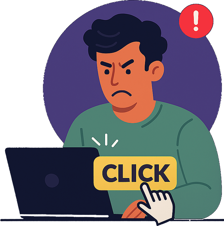
Reach us easily via WhatsApp, live chat, or email.
Contact UsJoin our partner program and turn ad-fraud protection into a scalable, recurring revenue stream.